12 Best Call-To-Actions which you can’t opt out without sign-up
Think about all the times you’ve signed up for things in your life. Did you once subscribe or sing-up Netflix? Tidal? Evernote? Maybe you’ve experience of some tempting sign-ups where you end up providing your details.
Each one of these signups is likely a result of an effective call-to-action.It’s really important to guide your visitors through the buying journey using strategic calls-to-action (CTAs). Think about it: If you hadn’t been drawn in by the copy or design of the CTA, or been guided so eloquently through your sign-up process, you would probably use a lot fewer apps and websites than you do now.
1) Netflix
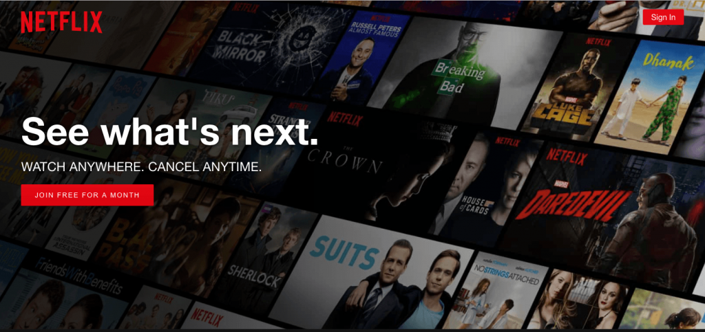
One of the main fear any visitors suffers is that if they sign up for something and they don’t like it , then it will become a pain for them to cancel the subscription.Netflix nips that fear in the bud with the “Watch Anywhere Cancel anytime” copy right above the “Join Free for a Month” CTA. I’d venture a guess that reassurance alone has boosted signups because once someone give the assurity that you have the option to opt-out any time you want. You can also notice that the red colour CTA and logo provide a connection and clear action message as what are you signing-up for.
2) Dropbox
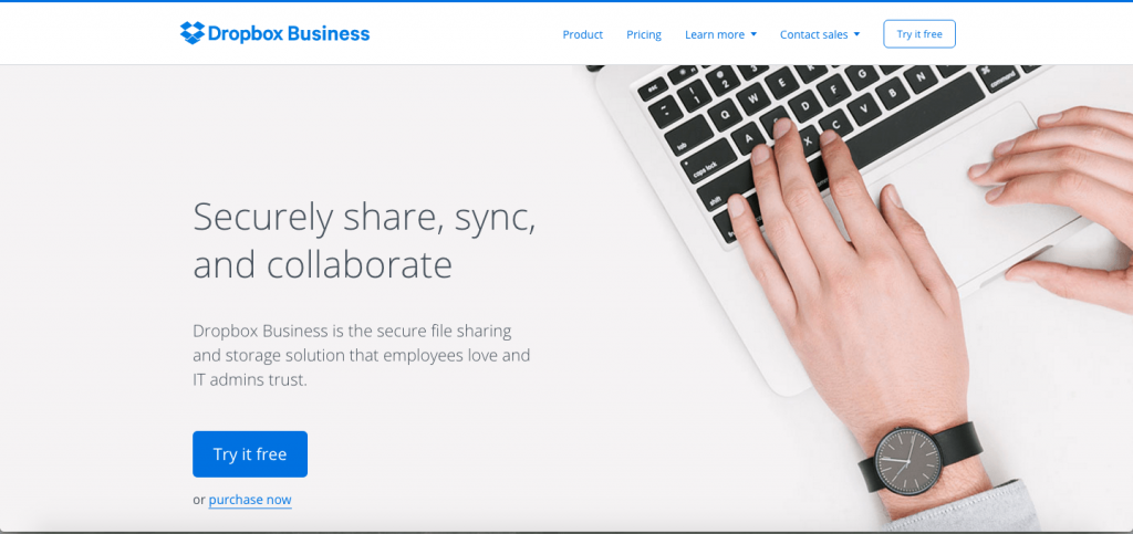
A simple and to the point design for CTA , Dropbox has always been providing a clear & easy idea of their business objective.The “Try it free” CTA is simple and clear. Even the graphics on their homepage are subtle and simple.The blue “Try it free” call-to-action button stands out from everything else on the page. Since the CTA and the Dropbox logo are the same colour, it’s easy for the visitor to interpret this CTA as “Try it for Dropbox.” That’s one effective call-to-action.
3) Evernote
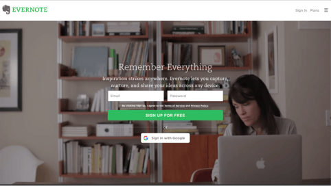
“Remember Everything.” Visitors can immediately understand that message the moment they land on this page. The design on Evernote’s website makes it super simple for users to see quick benefits of using the app and how to actually sign up to use it. The “sign-up for free” and below sign in with google provide a friendly experience on this landing page.while you are on this page you will find some 2-3 images swapping and giving you different views of different individuals’s interest
4) OfficeVibe
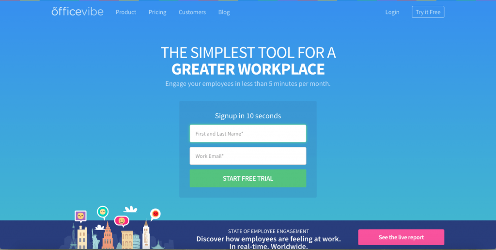
Here’s a slide-in call-to-action that caught my attention from OfficeVibe. The clear message on this landing page talks about the benefits for the employee if they engage for this tool. Also the urgency to singup in 10seconds simply demands quick action on it. At the same time “start free trial” CTA attracts the attention of the visitors. The colour used in tabs again separates the messages and it’s CTA.
5) OKCupid
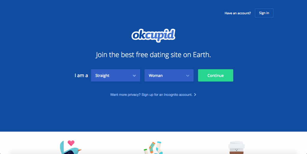
OKCupid’s CTA doesn’t seem that impressive at first glance, but its brilliance is in the small details. The call-to-action button, which is green and stands out well on a dark blue background, says, “Continue,” which give hope that the signup process is short and does not take long. Again if we go below the tabs we see another CTA ” want more privacy ? sing up for an incognito account ? provides a trust that their privacy on internet can be addressed.
6) Tidal
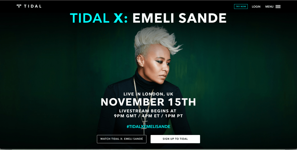
Tidal landing pages is so vibrant and life that any music lover simply end-up signing the form. The clear bright image on top and the dark background simply presents a clear message ,Below that the white colour sign-up button matches with the logo colour of Tidal. For me CTA is simple and clear to understand and the landing page made very attractive. Where as Try Now button at top appeal a quick action.
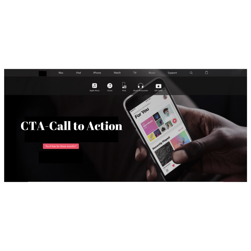
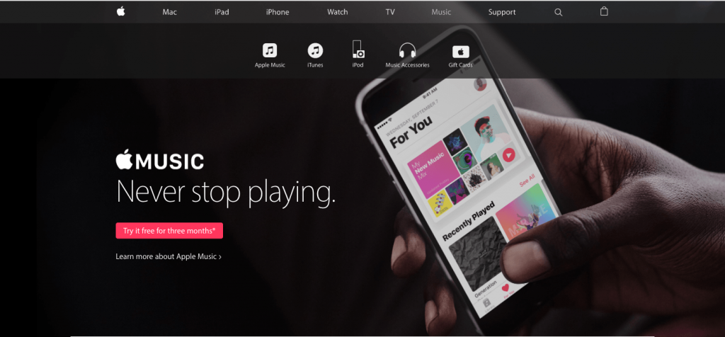
I think i have never seen a so clear and decent landing page with appealing CTA – “Try it free for three months “. Apple music store made their landing page so better with the combination of dark and light colour mixes. “Never Stop playing” simply pulling the interest of the music over to sing-up. The red colour button for call-to-action is superb way of putting action required tab.
8) Uber
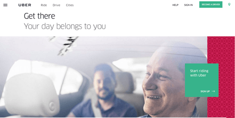
Uber has very clear business objective if it comes to their landing page , they look for very distinct types of people to sign up on their website: riders and drivers. Both personas are looking for totally different things, and yet, the website ties them together really well with the large video playing in the background showing Uber riders and drivers having a good time in locations all over the world. Both the call to action “Become a driver” and “start riding with uber” in green stands out from the over all page and represents a clear message . It doesn’t get much more straightforward than, “Start riding with uber.” Now that’s speaking people’s language.
9) Pinterest
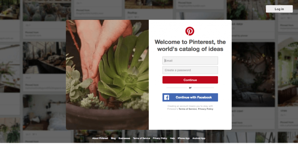
“Welcome to Pinterest , the world’s catalog of ideas ” the tag creates a curiosity as what could be inside for me. The most simple way of asking for sing-up makes it easy and convenient for visitors to go ahead with the CTA. where as sing up via Facebook with this blue coloured button “continue with Facebook” appears very prominent and recognisable to the most popular social media of 21st century.Facebook sing-up makes visitors work easy because Pinterest can pull in Facebook’s API data and get more information about you than if you log in through your email address.
Although this homepage is optimised to bring in new members, you’ll notice a very subtle CTA for folks with Pinterest accounts to log in on the top right.
10) Instagram
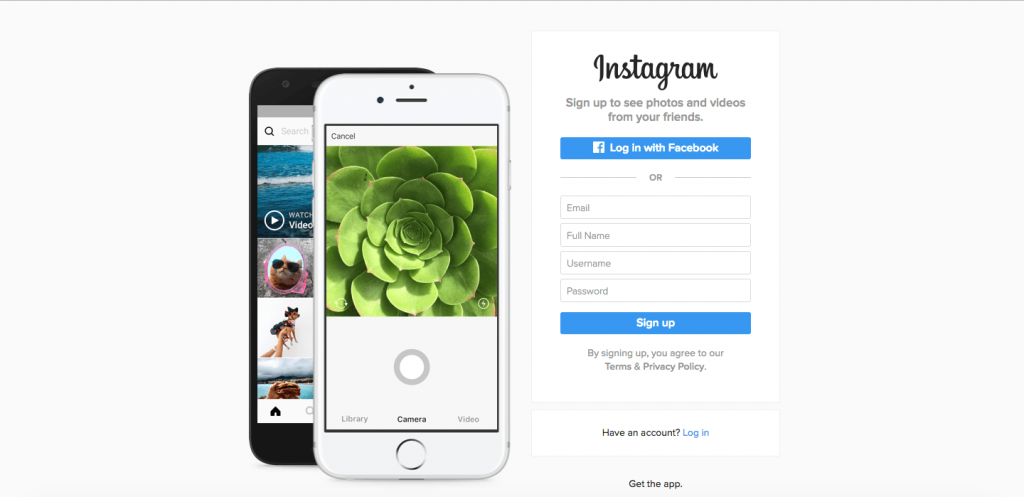
Since Instagram is a mainly mobile app, you’ll see two blue CTAs of equal size: one to connect through Facebook, and another to provide email id to start downloading it through different stores. The reason these CTAs are of equal caliber is because it doesn’t matter if someone sing up from Facebook or through email … creating an account is what exactly Instagram is optimising for. If you already have Instagram, you can also click the CTA to “Log In” if you’d prefer that option, too.
11) Qatar Airways
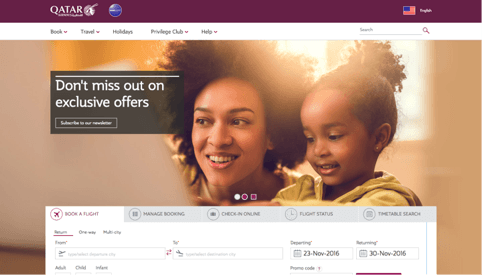
Qatar airways one of the 5 star airline has lot to say with it simplest form of call-to-action , “Don’t miss out on exclusive offers” and below that “Subscribe to our newsletter” CTA. The image of a mother with her daughter provide the feeling of a family,where the daughter feel safe and cosy in her mother’s arm. For me it represents the care and concern like a family member do. It speaks the language of people having happy family experiences. Qatar airways this landing page speaks out that if they opt for their exclusive offer they can enjoy the homely environment while travelling with them.
12) charity: water
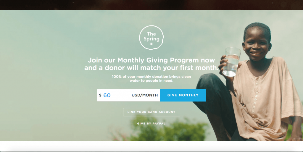
Charity: water one of the NGO for needy people is having a main mission to arrange clean and potable water and for that they seek donation from different visitors on their website — but they can’t assume that everyone wants to pay the same way. The CTAs featured on their homepage take a really unique approach to offering up different payment methods by pre-filling $60 into a single line form and including two equally important CTAs to pay via linking bank account or PayPal. Notice how both CTAs are of the different size and design — this is because charity: water likely doesn’t care how you donate, as long as you’re donating.
If you like the article/blog , please like and share it.
Watch out for the next blog will be on Lead-Generation and it’s importance.
Director Digital & Social Media Marketing | Affiliate Marketing | Media Buying | Trainer / Visiting Faculty Digital Marketing. Having 14+ Years of Experience in Digital Marketing. It was my hard work and effort that I was bestowed with “India’s Top 100 Digital Marketing Leadership Award” and “Indian Achiever’s Award” 2022
